As we are used to associating the Riva del Garda Exhibition Centre to the most important international event dedicated to volume footwear, from next June we will have to broaden our horizons.
Following two editions at the Palavela in Riva del Garda, in fact, the Gardabags accessory fair will also make its debut at the headquarters in via Baltera, together with its precursor Expo Riva Schuh. A whole new venue for an event that, despite its young age, has all the appearance of a winning bet - especially when compared to significant data such as the one on the export of manufacturing in Italy - stabilized at +57% in 2018.
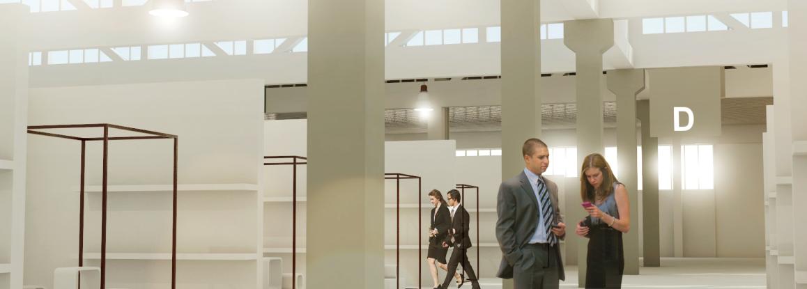
For Gardabags' debut at Baltera, the organizing company Riva del Garda Fierecongressi has selected an exhibition surface of about 4000 square metres located in the north-east area of the building. With a markedly industrial soul, this space has been redeveloped by Tale Office, on behalf of which architects Cella and Malossini tell us about the concept and background of Pavilion D: the new centre for Italian leather goods.
THE STARTING POINT
"Entering Pavilion D - a traditional complex that, over the decades, has been subdivided and distributed in different sections by different owners - one immediately notices a repetitive element of great strength that unifies, with its size and geometry, all the spaces of the future exhibition area: the load-bearing trusses. These elements, the only objects that unified all the previous internal subdivisions, are now freed from the dividing walls and infills made over the years, - thanks to the redevelopment - we can see them in their entirety (about 76 linear meters in length). The trusses allow wide spans and natural light within the nearly 4000 square meters while almost rhythmically scoring, with their compositional geometry, the new exhibition spaces. My work was therefore to enhance this element by cleaning it and intervening on the elements below it: secondary beams, artificial lights, columns and floors. New colours and lighting are applied to these elements, to define the different exhibition areas and to guide visitors through this large scale container’’.
THE FLEXIBLE ENVIRONMENT
"One element that breaks up the structure of the shed is the large pavilion, with its vaulted ceiling, located in the north-eastern corner of the area. This space, with its almost solemn volume, was used as a convivial area during trade fairs. Thanks to stairs and platforms that lead to a slightly lower altitude, this area will host a bar-restaurant, as well as a stage with ramps and steps that allow the fairgrounds a flexibility of events and visitors a flexibility of use, ranging from relaxing to consolidating professional relationships. The choice of lighting technology for this space was fundamental and unusual: a large sphere of light hanging from the ceiling, which with its light attracts and relaxes visitors, interrupting the many visual and working stimuli typical of a trade fair event’’.
THE ARTISTIC TOUCH
"Finally, taking inspiration from the geometries of the truss, an object was created with artistic references (Artistic ref: "Les Mobiles" Alexandre Calder) which, with its shape and colours, tries to thematically unite all this new exhibition surface: a series of metal and plexiglass trapezoids hung at different heights, and positioned perimetrically inside the shed'. In addition to indicating the exits and passages to the other pavilions, these suspended objects, like the luminous sphere or the light coming in from the structural beams, try to attract the visitors’ eyes by changing their perception of the light and the space above them".

